

How to Choose Fabrics for Your Red Sky At Night Quilt
I'm about to start my new Red Sky at Night Quilt that I'll be making through the Quilt-Along starting this month. Which colours will you choose? Will you narrow down to just two? Or will you go scrappy? There are lots of fun different options for colouring in, with one strict limitation - it's essentially a 2-colour quilt. Let me share some of the ways I, and others, have interpreted these 2 colours, and created some beautiful options to inspire you!

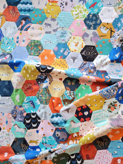
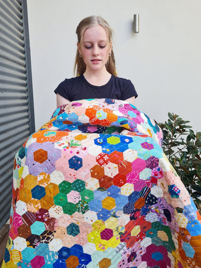
Completely Scrappy!
For my original version, I trawled through my scraps and fabric stash. I cut one or two pieces from each print in both high and low volume. I purposely avoided prints that were close to low volume but not quite. I have a collection of light coral, but skipped those. I used a little fluro yellow, but ended up replacing most of it. I wanted to create a quilt that was high contrast. I wanted to be able to see the pattern of each block.
If you're going scrappy, I recommend using your favourites. It can be fun in scrappy quilts to hide your least favourite fabrics and finally use them up. But I found that I never reached for them when it came to make the blocks, and in the end, I was left with a pile of units I didn't like much. I ended up going back and making more units to finish up the last blocks.
Scrappy with a Single Background
I love Lucy's take on scrappy for her version below. She's chosen her favourite, happy florals that contrast with this Kona Kelly green. Isn't it delicious? If you love this version, choose a favourite background colour, and then start to add in prints from your stash that complement it, while also providing contrast.

Two-Tone Scrappy
I dream of making a teal and white quilt, but in the same manner as my completely scrappy version, choosing my favourite teal and green and blue fabric scraps, and low volume prints, leaving out the warm colours. I can imagine a quilt on my bed just like it!
You could also make something in the same fashion as my Pirouette Quilt here. Low Volume Scrappy with a single 'dark' print. Ooh! I have some navy that would go perfectly. I think I'm adding that one to my list too!


Using a Fabric Collection
For my EPP-only version of Red Sky at Night, I used Anna Maria Horner's Good Gracious and Our Fair Home fabric collections. I just love how they look together! I decided a random, scrappy low volume might look a bit busy, and Anna Maria doesn't include many low volumes in her collections, so I dug out this old Loominous print of hers from several years ago. It's got a gold thread running through it, making the grid pattern, and it's beautiful! I love how it draws all the attention to the rich colours, while also adding a little softness.


Adding to a Fabric Collection
I bought this Heirloom palette bundle by Brittany of Lo and Behold Stitchery for my next version. I wanted a more narrow palette, and a little hand-holding choosing the colours. I love using the 'Pallete Picks' by Robert Kauffman for this! (You can see the Ice Cream Soda Quilt I made using the same method here.)
My original intention was to just use the fabric on it's own, but I just couldn't get started! When some new Ruby Star Society fabric arrived this week, I had a play and added 18 extra prints and took away the charcoal ones. Then I decided to change the background from Neon Neppy (the beautiful charcoal with colourful highlights) to this navy Grunge by Moda. As much as I love the Neppy (and prefer it own it's own), I was longing for some cool blue balance. I'm going to mix in some of that navy hearts print for background, too!
In my personal experience, I struggle to enjoy solids on their own, and love the introduction of florals. I also struggle to use Ruby Star collections on their own. They're often very warm and a little limited in their palette. By combining these two collections, it feels a bit more balanced and full to me. I'm going to enjoy sewing with these! Using a fabric collection as your starting point, and then drawing other fabrics in, is a great way to choose a palette you love, with help, but also use up favourites from your stash.
Even though I have a single background and lots of fat quarters for the foreground, I'm going to follow the instructions for "scrappy" in the quilt pattern. This will give me a better spread of colour than cutting strips for a 2 colour version and sewing them as the pattern instructs. (See the Red Sky at Night pattern for more details.)

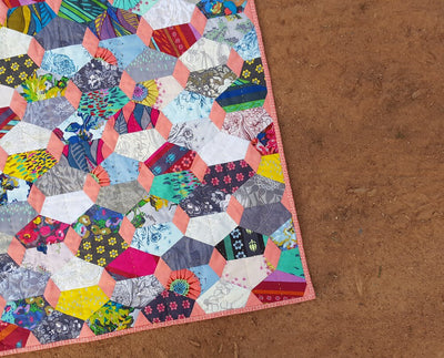
Using Two Colours
I chose this black floral for my version with only machine pieced blocks. I like it close up and snuggly more than I like it out flat, but I enjoyed the experiment. I've always wanted to make a black and white quilt and now I have! I also really enjoyed the quick cutting, and the zero decisions that using 2 colours provided. I wonder if I had my time again, whether I'd choose a light plum from the tiny flowers to go with the black, rather than white? Or maybe I'd choose something a bit more busy and colourful for the main colour?


History has given us so many beautiful 2 colour quilts. Perhaps you'd like to walk in the steps of quilters past and choose the traditional red and white, or blue and white? Or perhaps you'd enjoy something with less contrast (and less white to keep clean!)? This mock-up that Lisa made uses a rich gold, and 2 shades of pink. I just know I'd love having these colours in my hands over and over while I made my quilt. It feels so warm and cosy and comforting to me!

Choosing a Highlight Colour
The English Paper Pieced blocks in Red Sky at Night look great with a highlight colour if you're sticking to 2 colours for the rest. Lisa's aqua and white version, with a pop of coral is a beautiful choice! She's using Rifle Paper Co's Bramble Fields in Light Blue from their Curio fabric collection with AGF Pure Solids in "snow" for all of the machine pieced blocks, and "grapefruit" as a gorgeous contrasting highlight for the EPP blocks. Choosing a colourful single print made it easy to decide on the coral highlight for the EPP, a colour that is featured in the sweet flowers.
When choosing the highlight, decide if you want a POP of colour to draw your eye, or a more gentle complement. In the examples above, I've chosen just a shade lighter as the highlight so that you still get that 2-colour feel. If you want something a bit more striking, choose a colour on the other side of the colour wheel.


What fabrics would you choose for your Red Sky at Night quilt?
So much of choosing fabric for me comes from vibes and experience. When I made my scrappy, I already knew from trial and error that I feel most at home with scrappy. I like to work with it, and I like how it looks at the end. When I made my black and white, it was with a more playful, "try this and see" approach. It doesn't really feel like "me," but I still had fun making it!
When choosing the colours for your Red Sky at Night Quilt, tune in to what you want. Do you want something for yourself, with familiar colours from stash that you know you'll love? Or are you making it for someone else? Do you want to rest in the ease of cutting and sewing with 2-3 colours, and not needing to make any further decisions along the way? Or do you think you'll love putting the scrappy units together into blocks? Have you always had a 2 colour quilt like the antique ones on your bucket list? Or do you love the different scrappy approach to samplers that Red Sky at Night offers?
Often, when you answer these questions before diving in, the colour choices become less fraught. If we know we are trying something new, we can be more relaxed even if we don't love it in the end. We can learn and try again. If we know we long for something undemanding and simple, we can choose 2 colours and enjoy the process, rather than worry about how different or show-stopping the end result will be.
The goal with choosing your colours and approach is JOY. Joy, not just in the finished product, but in the making. What will make you happy, making this quilt?


Some great ideas and options Jodi. I love your teal-green-blue idea, would be quite striking.
Leave a comment